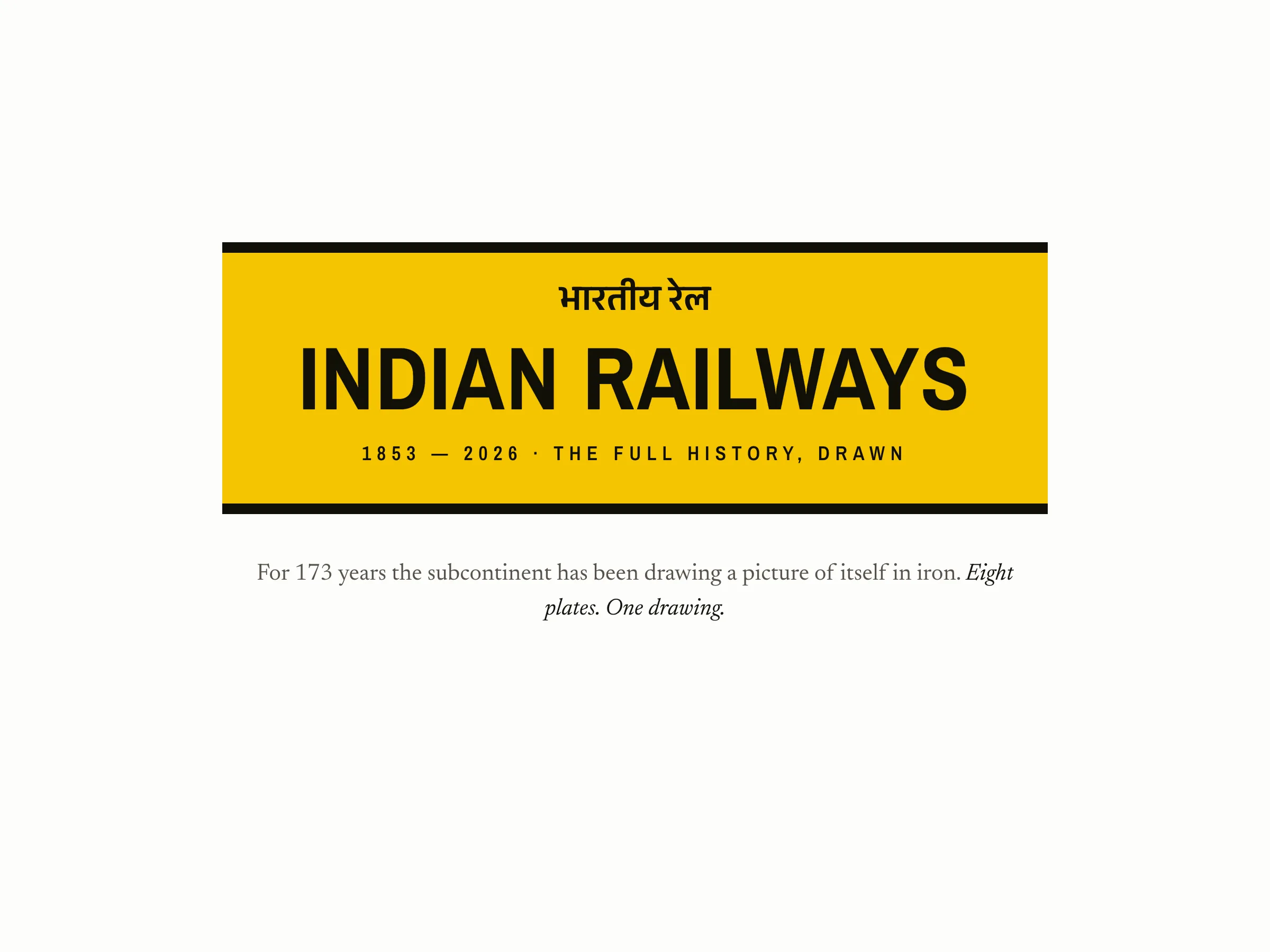
Akash
Wadhwani

Interaction Designer & Front-End Builder.

Akash Wadhwani in clay
I make complicated things
easier to understand.

Hi, I'm Akash. I design and build interactive products end to end: the idea, the design, and the code. For most of the last decade I've done one job in different costumes, taking technology people find complicated, or a little intimidating, and making it feel friendly enough to trust.

I've done it building web for 40 million visits a month at Deloitte, getting century-old engineers onto software they feared at Rolls-Royce, and spending five years co-founding OatMlk into seven countries. Lately on the human side of AI, at Radix and Transak, taking a team from scared of it to using it every day.

Now I run sheets.works, shipping a new interactive piece almost every day. 77 so far, 450,000 visitors in three months, one in The New York Times. I don't hand off mockups, I build the real thing in code. The whole job: take something complicated and make it obvious.

Places I've worked

From a Big Four consultancy to my own studio. Click any logo to see what I did there.6
Deloitte
2017–2018
Rolls-Royce
2019
OatMlk
2020–2025
Radix
2025–now
Transak
2026
sheets.works
2026–now

Places I've lived

Home keeps moving. Here's the whole map of it.5
Kanpur
1995–2014
Bengaluru
2014–2017
Mumbai
2017–2018
London
2018–2020
Kanpur
2020–now

The work I'm proudest of. Each one is the real, working thing, so have a play, and see the data behind it.

The Listening Museum67 mechanical keyboards, sound-mapped. Click one and play it.

Pick a keyboard, then type, and you hear exactly how it sounds, from a 1985 IBM Model M to a modern thock. The idea was simple, really: I wanted to make something for the keyboard nerd in me, and for everyone else who has ever loved the sound of a good key. The full version maps 67 of them.

Pick a keyboard above, then type or tap the keys below to hear it.
TYPE
Data
67 keyboards, sound-mapped from the open-source community, each with its switch type, spring weight and travel. 500+ real audio samples, from a 1985 IBM Model M to modern thock.
Idea
Something for the keyboard nerd in me, and the world. Every switch sounds different, and you can't really put that into words, so I let you simply hear it, one keystroke at a time.
Process
Every keyboard sound test online is a video you watch. But a keyboard's sound is physical, it comes from your own fingers, and watching someone else type is the wrong sense for it. So I wanted people to actually use the keyboards, not watch.

I gathered the community's real recordings, gave each keyboard one playable card, and wired it so your own typing makes the sound. Then I got the design out of the way: a quiet museum, one specimen at a time, so the sound is the loudest thing in the room.
Reach
Written up in The New York Times. Hit the front page of Hacker News. #1 on Google for “listening museum,” with 122k Search impressions and 100k+ visits.
Feedback
“I was charmed to learn of the Listening Museum, a site where visitors can bask in the sounds of 36 keyboards and typewriters. The specimens are tagged with quirky designations for the sounds they make, like ‘pingy clack,’ ‘bright click’ and ‘rounded thock.’”
— Melissa Kirsch, The New York Times

Every Starlink, Orbiting NowA live, spinnable globe of every Starlink in orbit right now.

A live, spinnable globe of every Starlink satellite in orbit right now, each dot plotted from the public catalogue and propagated in your own browser. Drag to spin it. Tap any dot for the real satellite. I wanted to take something invisible and everywhere and make it small enough to hold, and find one real satellite passing over your head this second.

Loading the constellation…
drag to spin · tap a dot
Data
10,500+ satellites, propagated live with SGP4 (NORAD's own model) from CelesTrak's public GP catalogue, originally tracked by the US Space Force. The snapshot refreshes on my server every couple of hours.
Idea
Starlink is everywhere and invisible. I wanted to make the whole constellation something you could hold, spin, and reach into, right down to a single named satellite.
Process
One fact would not leave me alone: a single company has built most of the active satellites in orbit, in about seven years. That is invisible from the ground and impossible to picture, and I wanted to make it something you could hold and turn, not just a number.

So I plotted every single one, not a sample, and let you reach in and touch a real satellite passing overhead right now. The hardest part was trust: it runs on someone else's public data, so I went to the people who maintain the catalogue to make sure the lineage was honest. Beautiful mattered, but right mattered first.
Reach
#1 on r/Space, the largest space community on the internet, for two days, and 47k views on the site.
Feedback
“This is really cool. Just posted about it on my Bluesky.”
— Jonathan O'Callaghan, British Science Journalist of the Year 2024 (Scientific American, NYT, BBC)

Point by PointThe 2025 Roland-Garros final, replayed shot by shot.

We took the hand-charted shot data of the 2025 Roland-Garros men's draw and turned it back into tennis. Every point, replayed shot by shot on the clay. This is the final, Alcaraz against Sinner, and every shot you see is a real one, charted by hand from the actual match. Press play, or pick any point on the timeline.

Press play, or pick any point below.
Loading the match…
Data
50 matches of the 2025 men's draw, 11,258 points, every shot's direction and depth hand-charted from the volunteer Match Charting Project. The final alone is 385 points and 1,610 shots.
Idea
A scoreline tells you who won, never how. I wanted to feel the rallies, the angles and the momentum, point by point, the way it actually happened on the clay.
Process
Tennis data is just rows: server, direction, depth, outcome. Beautiful to a stats nerd, invisible to everyone else. I wanted to turn those rows back into the thing they came from, motion on a court, so you could watch a point instead of reading a spreadsheet of it.

So I reconstructed each rally's ball path from the charted shots and animated it on the clay, one point at a time, with a timeline of every point in the match. It is a reconstruction, not ball tracking, and I say so plainly on the page. The goal was never perfect physics; it was to make a row of data feel like a rally again.
Reach
27k visitors on the site, and 102k points played in the browser.
Feedback
“Super cool. This is amazing! Wow, congrats.”
— Danilo De Rosa, a newsletter subscriber

The Whole History, DrawnEvery Indian railway line since 1853, on a living map.

Every railway line ever opened in India, drawn from the original section-by-section opening records, from the first train in 1853 to the Chenab bridge in 2025. Drag the timeline and watch the network grow. This one is personal: it is the country I am from, and somewhere in there is the year the line first reached my home town.

Drawing the network…
0stations0km2026
Data
850 dated line sections and 7,927 dated stations, placed against a gazetteer of 13,000+ stations and routed along today's real rail alignments. From Bori Bunder 1853 to the Chenab bridge 2025, including the day the network was cut in two at Partition.
Idea
I wanted to see my country's railways as one living thing, 170 years of it, and find the exact year the line first reached my own home town.
Process
The history of the railways is buried in section-by-section opening ledgers, dry as dust and impossible to picture. I wanted to turn that ledger back into a map you could feel grow, and watch a partition cut the network in two.

The hard part was honesty. Colonial spellings had to be translated (Cawnpore to Kanpur), vanished lines drawn as ghosts, and every line we could not yet date shown in grey, so the map never pretends to know more than it does. Where I could not date something, I said so. A map of a country's memory has to be careful with the truth.
Reach
22k visitors on the site, and featured in Datawrapper's Data Vis Dispatch.
Feedback
“Thanks for sharing your work, the tooltips, wow!”
— Michael Do Thoi, Datawrapper

Featured in

A few places the work has shown up.4
The New York Times
feature
Hacker News
front page ×2
9to5Mac
feature
Forbes
30 Under 30

Tools used

Everything here is designed and built end to end with these.6
Claude
ChatGPT
Gemini
HTML
CSS
Three.js

How I think about the work

A few convictions that show up in everything I make. The projects prove them; these are the why.

I make complicated things feel obvious.

Take something genuinely hard, or a little intimidating, and design it until a person just gets it. No manual, no explaining. That is the whole job.

With AI, trust is the whole game.

Anyone can ship the feature. The hard part is getting a human to trust it enough to use it, and to feel in control while it acts on their behalf. That is where design lives now.

I build the real thing, in code.

No mockups, no hand-offs. A prototype that lies about how it actually feels is worse than nothing. I design and build at once, until you can reach in and touch it.

Every pixel earns its place.

I cut, then cut again, until the data is the loudest thing in the room and everything else gets quietly out of the way.

AI is how I work, not just what I work with.

I treat it like a fast, relentless teammate: arguing with it, directing it, building alongside it. Some days that is sixteen hours straight, more than I spend talking to people.

Ship it, then listen.

I put the real thing in front of real people fast, then let their reaction, a journalist, a community, a scientist, decide what to make next.